Chapter 19 Social Network Analysis
19.1 Working with Network Data
We’ll use the popular igraph package to explore the student slack network in R. The data has been anonymized for use in this text. First, we load the two data frames that contain the information for our network:
- SlackNetwork contains the interactions between pairs of students. An interaction between students was defined as either an emoji-reaction or threaded reply to a post. The source of the interaction is the individual reacting or replying and the target of the interaction is the user who originated the post. This data frame also contains the channel in which the interaction takes place, and 9 binary flags indicating the presence or absence of certain keywords or phrases of interest.
- users contains user-level attributes like the cohort to which a student belongs (‘blue’ or ‘orange’).
library(igraph)
load('LAdata/slackanon2021.RData')head(SlackNetwork)## source target channel notes study howdoyou python R SAS beer
## 1 U0130T4056Y U0130T30B36 random FALSE FALSE FALSE FALSE FALSE FALSE FALSE
## 2 U012UMSH7FC U0130T30B36 random FALSE FALSE FALSE FALSE FALSE FALSE FALSE
## 3 U012N097BUN U0130T30B36 random FALSE FALSE FALSE FALSE FALSE FALSE FALSE
## 4 U012E0B3YBZ U0130T30B36 random FALSE FALSE FALSE FALSE FALSE FALSE FALSE
## 5 U0130T1GKMJ U0130T30B36 random FALSE FALSE FALSE FALSE FALSE FALSE FALSE
## 6 U0130T486SY U0130T30B36 random FALSE FALSE FALSE FALSE FALSE FALSE FALSE
## food snack edgeID
## 1 FALSE FALSE 1
## 2 FALSE FALSE 2
## 3 FALSE FALSE 3
## 4 FALSE FALSE 4
## 5 FALSE FALSE 5
## 6 FALSE FALSE 6head(users)## userID Cohort
## 1 U012E07QP1D o
## 2 U012E08EWTZ b
## 3 U012E08R0CX o
## 4 U012E08TYMV b
## 5 U012E096VF1 o
## 6 U012E09JRAB oUsing this information, we can create an igraph network object using the graph_from_data_frame() function. We can then apply some functions from the igraph package to discover the underlying data as we’ve already seen it. Because this network has almost 42,000 edges overall, we’ll subset the data and only look at interactions from the general channel.
19.2 Network Visualization - igraph package
SlackNetworkSubset = SlackNetwork[SlackNetwork$channel=='general',]
slack = graph_from_data_frame(SlackNetworkSubset, directed = TRUE, vertices = users)
plot(slack)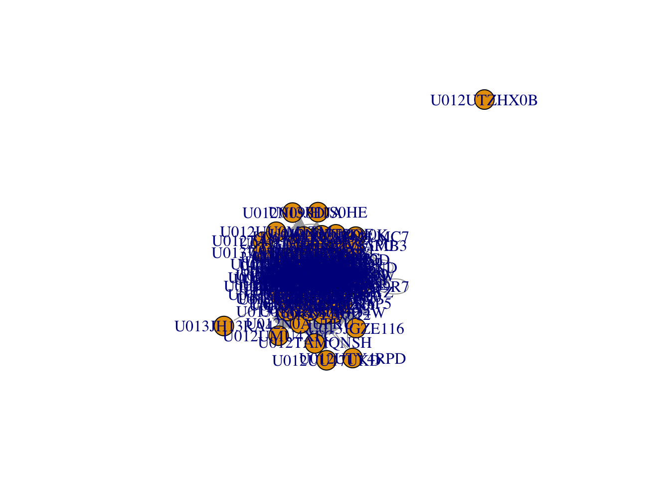
The default plots certainly leave room for improvement. We notice that one user is not connected to the rest of the network in the general channel, signifying that this user has not reacted or replied in a threaded fashion to any posts in this channel, nor have they created a post that received any interaction. We can delete this vertex from the network by taking advantage of the delete.vertices() function specifying that we want to remove all vertices with degree equal to zero. You’ll recall that the degree of a vertex is the number of edges that connect to it.
slack=delete.vertices(slack,degree(slack)==0)There are various ways that we can improve the network visualization, but we will soon see that layout is, by far, the most important. First, let’s explore how we can use the plot options to change the line weight, size, and color of the nodes and edges to improve the visualization in the following chunk.
plot(slack, edge.arrow.size = .3, vertex.label=NA,vertex.size=10,
     vertex.color='gray',edge.color='blue')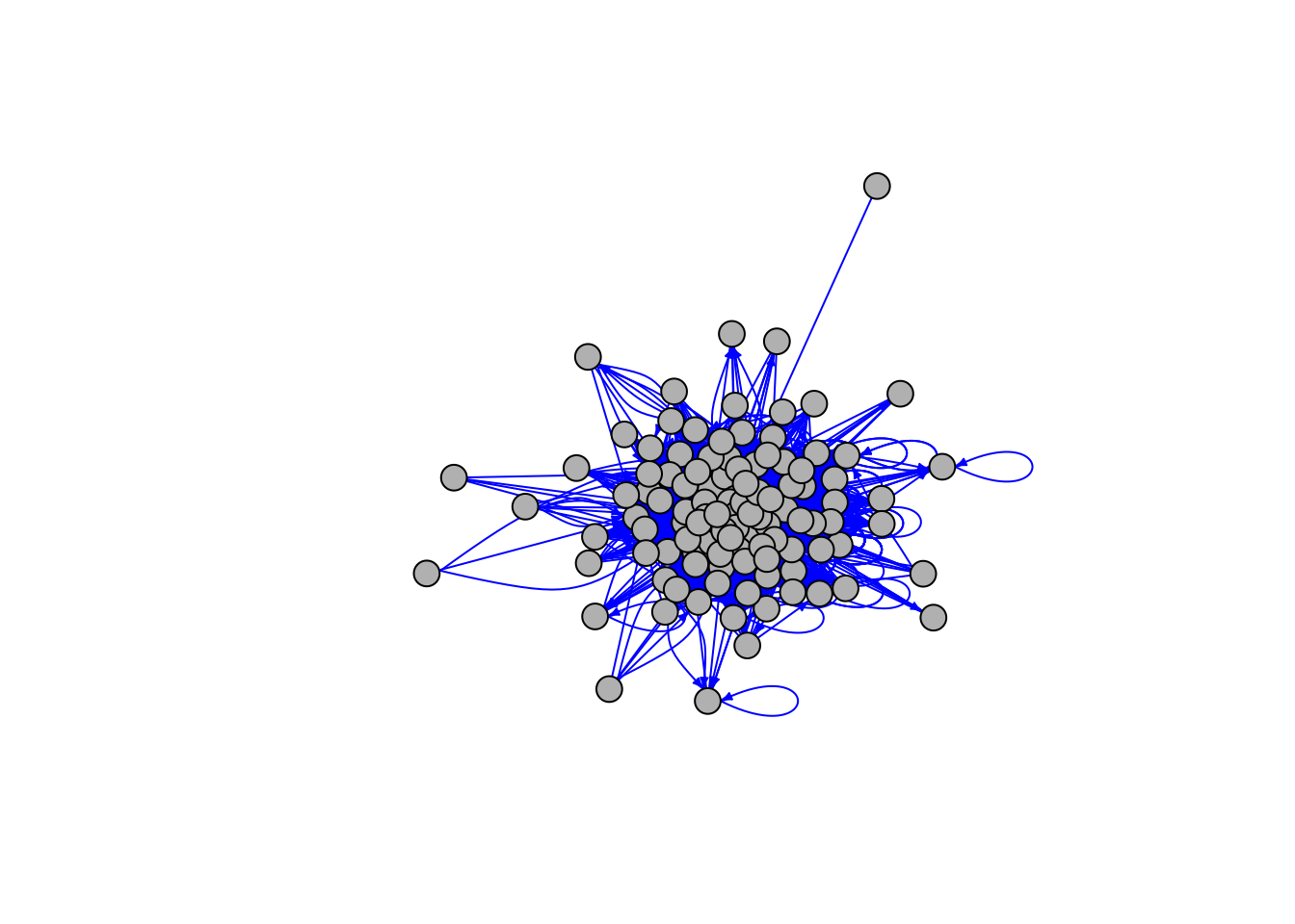
19.2.1 Layout algorithms for igraph package
The igraph package has many different layout algorithms available; type ?igraph::layout for a list of them. By clicking on each layout in the help menu, you’ll be able to distinguish which of the layouts are force-directed and which are not. Force-directed layouts generally provide the highest quality network visualizations. The Davidson-Harel (layout_with_dh), Fruchterman-Reingold (layout_with_fr), DrL (layout_with_drl) and multidimensional scaling algorithms (layout_with_mds) are probably the most well-known algorithms available in this package.
We recommend that you compute the layout outside of the plot function so that you may use it again without re-computing it. After all, a layout is just a two dimensional array of coordinates that specifies where each node should be placed. If you compute the layout inside the plot function then every time you make a small adjustment like color or edge arrow size, you will have to your computer will have to re-compute the layout algorithm.
The following code chunk computes 4 different layouts and then plots the resulting networks on a 2x2 grid for comparison. We encourage you to substitute four different layouts (listed in the help document at the bottom) in place of the ones chosen here as part of your exploration.
#?igraph::layout
l = layout_with_lgl(slack)
l2 = layout_with_fr(slack)
l3 = layout_with_drl(slack)
l4 =  layout_with_mds(slack)
par(mfrow=c(2,2),mar=c(1,1,1,1))
# Above tells the graphic window to use the
# following plots to fill out a 2x2 grid with margins of 1 unit
# on each side. Must reset these options with dev.off() when done!
plot(slack, edge.arrow.size = .3, vertex.label=NA,vertex.size=10,
     vertex.color='lightblue', layout=l,main="Large Graph Layout")
plot(slack, edge.arrow.size = .3, vertex.label=NA,vertex.size=10,
     vertex.color='lightblue', layout=l2,main="Fruchterman-Reingold")
plot(slack, edge.arrow.size = .3, vertex.label=NA,vertex.size=10,
     vertex.color='lightblue', layout=l3,main="DrL")
plot(slack, edge.arrow.size = .3, vertex.label=NA,vertex.size=10,
     vertex.color='lightblue', layout=l4,main = "MDS")
To reset your plot window, you should run dev.off() or else your future plots will continue to display in a 2x2 grid.
dev.off()19.2.2 Adding attribute information to your visualization
We commonly want to represent information about our nodes using color or size. This is easily done by passing a vector of colors into the plot function that maintains the order in the users data frame. We can then create a legend and locate it in our plot window as desired.
plot(slack, edge.arrow.size = .2,
     vertex.label=V(slack)$name,
     vertex.size=10,
     vertex.label.cex = 0.3,
     vertex.color=c("blue","orange")[as.factor(V(slack)$Cohort)],
     layout=l3,
     main = "Slack Network Colored by Cohort")

legend(x=-1.5,y=0,unique(V(slack)$Cohort),pch=21,
       pt.bg=c("blue","orange"),pt.cex=2,bty="n",ncol=1)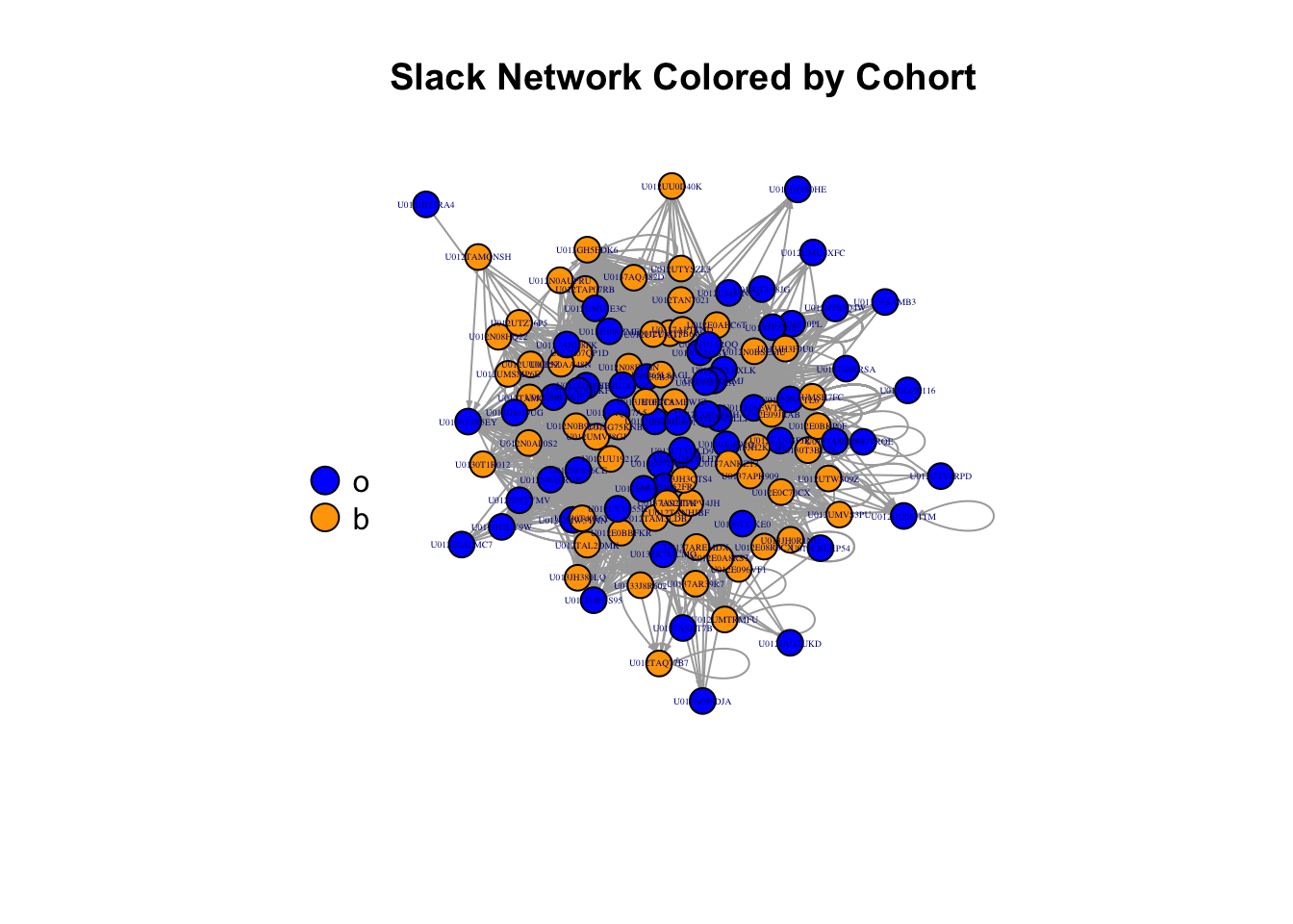
A (nearly) complete list of plot option parameters is given below:
- vertex.color: Node color
- vertex.frame.color: Node border color
- vertex.shape: Vector containing shape of vertices, like “circle,” “square,” “csquare,” “rectangle” etc
- vertex.size: Size of the node (default is 15)
- vertex.size2: The second size of the node (e.g. for a rectangle)
- vertex.label: Character vector used to label the nodes
- vertex.label.color: Character vector specifying color the nodes
- vertex.label.family: Font family of the label (e.g.“Times,” “Helvetica”)
- vertex.label.font: Font: 1 plain, 2 bold, 3, italic, 4 bold italic, 5 symbol
- vertex.label.cex: Font size (multiplication factor, device-dependent)
- vertex.label.dist: Distance between the label and the vertex
- vertex.label.degree: The position of the label in relation to the vertex (use pi)
- edge.color: Edge color
- edge.width: Edge width, defaults to 1
- edge.arrow.size: Arrow size, defaults to 1
- edge.arrow.width: Arrow width, defaults to 1
- edge.lty: Line type, 0 =“blank,” 1 =“solid,” 2 =“dashed,” 3 =“dotted,” etc
- edge.curved: Edge curvature, range 0-1 (FALSE sets it to 0, TRUE to 0.5)
and if you’d like to try a dark-mode style visualization, consider the global graphical parameter to change the background color of your visual: par(bg="black").
Any one of these option parameters can be set according to a variable in your dataset, or a metric about your graph. For example, let’s define degree as the number of edges that are adjacent to a given vertex. We can size the vertices according to their degree by including that information in the plot function as follows, using the degree() function. We just have to keep in mind that the vertex.size plot attribute is expecting the same range of sizes that you would provide for any points on a plot, and since the degree of a vertex can be very high in this case, we should put it on a scale that seems more reasonable. In this example. we divide the degree by the maximum degree to create a number between 0 and 1 and then multiply it by 10 to create vertex.size values between zero and 10.
plot(slack, edge.arrow.size = .2,
     vertex.label=V(slack)$name,
     vertex.size=10*degree(slack, v=V(slack), mode='all')/max(degree(slack, v=V(slack), mode='all')),
     vertex.label.cex = 0.3,
     vertex.color=c("blue","orange")[as.factor(V(slack)$Cohort)],
     layout=l3,
     main = "Slack Network Colored by Cohort")

legend(x=-1.5,y=0,c("Orange","Blue"),pch=21,
       pt.bg=c("Orange","Blue"),pt.cex=2,bty="n",ncol=1)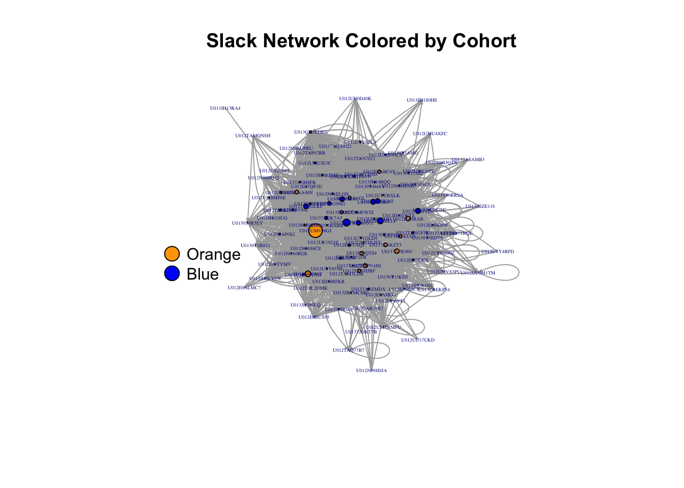
19.3 Package networkD3
The network D3 package creates the same type of visualizations that you would see in the JavaScript library D3. These visualizations are highly interactive and quite beautiful.
library(networkD3)19.3.1 Preparing the data for networkD3
The one thing that you’ll have to keep in mind when creating this visualization is the insistence of this package that your label names (indices) of your nodes start from zero. To use this package, you need a data frame containing the edge list and a data frame containing the node data. While we already have these data frames prepared, the following chunk of code shows you how to extract them from an igraph object and easily transform your ID or label column into a counter that starts from 0. You can see the first few rows of the resulting data frames below.
nodes=data.frame(vertex_attr(slack))
nodes$ID=0:(vcount(slack)-1)
#data frame with edge list
edges=data.frame(get.edgelist(slack))
colnames(edges)=c("source","target")
edges=merge(edges, nodes[,c("name","ID")],by.x="source",by.y="name")
edges=merge(edges, nodes[,c("name","ID")],by.x="target",by.y="name")
edges=edges[,3:4]
colnames(edges)=c("source","target")
head(edges)
## source target
## 1 80 0
## 2 77 0
## 3 99 0
## 4 22 0
## 5 101 1
## 6 71 1head(nodes)## name Cohort ID
## 1 U012E07QP1D o 0
## 2 U012E08EWTZ b 1
## 3 U012E08R0CX o 2
## 4 U012E08TYMV b 3
## 5 U012E096VF1 o 4
## 6 U012E09JRAB o 5Once we have our data in the right format it’s easy to create the force-directed network a la D3 with the forceNetwork() function, and to save it as an .html file with the saveNetwork() function.
19.3.2 Creating an Interactive Visualization with networkD3
The following visualization is interactive! Try it by hovering on or dragging a node.
colors = JS('d3.scaleOrdinal().domain(["b", "o"]).range(["#0000ff", "#ffa500"])')

forceNetwork(Links=edges, Nodes=nodes, Source = "source",
             Target = "target", NodeID="name", Group="Cohort", colourScale=colors,
             charge=-100,fontSize=12, opacity = 0.8, zoom=F, legend=T)
19.3.3 Saving your Interactive Visualization to .html
Exploration of the resulting visualization is likely to be smoother in .html, so let’s export this visualization to a file with saveNetwork().
j=forceNetwork(Links=edges, Nodes=nodes, Source = "source",
               Target = "target", NodeID="name", Group="Cohort",
               fontSize=12, opacity = 0.8, zoom=T, legend=T)
saveNetwork(j, file = 'Slack2021.html')
You can find the resulting file in your working directory (or you can specify a path rather than just a file name) and open it with any web browser.